


Flags on top
Remember to copy the entire code (both HTML and CSS), as it will not work if you skip one of the parts.
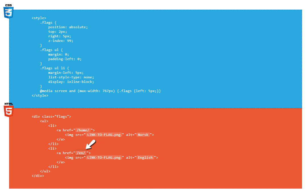
        <style>
            .flags {
                position: absolute;
                top: 2px;
                right: 5px;
                z-index: 99;
            }
            .flags ul {
                display: inline;
                margin: 0;
                padding-left: 0;
            }
            .flags ul li {
                margin-left: 5px;
                list-style-type: none;
                display: inline-block;
            }
            @media screen and (max-width: 767px) {.flags {left: 5px; width:100px}}
        </style>
        <div class="flags">
            <ul>
                <li>
                    <a href="/home/">
                        <img src="LINK-TO-FLAG.png" alt="Norsk">
                    </a>
                </li>
                <li>
                    <a href="/en/">
                        <img src="LINK-TO-FLAG.png" alt="English">
                    </a>
                </li>
            </ul>
        </div>
Other versions
Dropdown menu

This version requires the code to be updated for each time a change happens in the template (whenever the screen is smaller). Either play with the CSS yourself, or ask Viktor if you need help setting it up for the specific template.
See example on this page. Position changes depending on browser width.
Simple text
See an example of the text-version here.
If you want to change the color. Edit the hex #e4e4e4
Find hex codes here
Flags inside menu (for mobile)
<script>
if (window.innerWidth < 767) {
    var div = document.createElement("div");
    div.setAttribute("style", "text-align:right;height:32px;");
    var flags = document.querySelector(".flags");
    div.appendChild(flags);
    document.querySelector("#menu").prepend(div);
}
</script>
Important: This is script which should be included with the code which is on top, but inserted into the footer instead of the header.
This script moves the flags into the expandable menu on mobile devices. I added this as an alternative version because the code might not match up to all templates.
If you want to see what it looks like, check out htmltips.webnone.com on your phone, and open the menu.
Main instructions
- How do I use the first code?
Edit the parts with the white background by clicking on the text and changing it to whats relevant for the user.
1. Change the link /en/ to the language the user wants to set up. The one above saying /home/ is the one which will lead them to the default language - the language version of the portal the user was at when it was created.
If the user for example created the website in Italian, then /home/ is the link to the Italian front page.
2. We now need to add the picture link for the flag for the countries.
a. You are able to set the link to the image by editing where I wrote LINK-TO-FLAG.png. I have uploaded some flags which you can use. You can find the flags by clicking this button:
b. When you click on the button you will be sent to an album containing different flags. Right click on the flag that you want and copy image address:
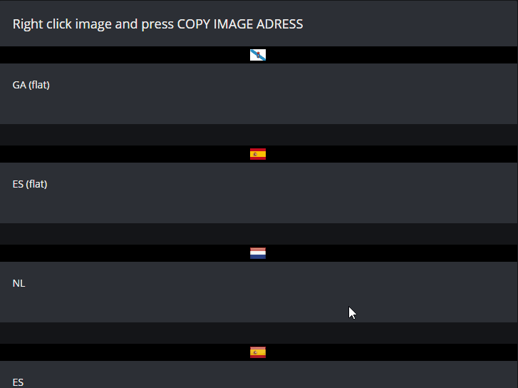
c. Paste the relevant flag for the relevant language where i wrote LINK-TO-FLAG.png
When you're done, copy both HTML and CSS code in both the orange and blue field.
Done. Where do I paste the code?
This depends on if the user wants the flags shown on all pages/frontpage above editable content.
On all pages
- SETTINGS > SETTINGS > HEADER/FOOTER > HTML CODEThis will show the flags on all pages in the same position. Premium Standard/Pro is required.
Only on spesific pages
- PAGES > "The page" > SEO SETTINGS > HTML-CODE IN HEADER
How do I change the position of the flags?
The code shows where to display the flags with the properties top and right.

You will have to edit the values top and right to set how far the flags should be pushed from either side of the screen. If you wish to have the flags on the left side of the screen instead, change right to left. This means you now will push the element from left and the set amount of pixels.
Hiding the language selection in the footer
You can hide the language selection which is available all the way in the bottom-right corner of the website by also adding this part of the code inside the <style> </style> tags:.wnd-multilang .footer-01.design-01 .lang-select {
visibility: hidden;
}
What about mobile?
@media screen and (max-width: 767px) {.flags {left: 5px;}}
If you wish the flags to look different on other sizes as well, just copy the whole @media rule and change the px amount in (max-width: 767px).
In my example it simply swaps side to the left side instead, so it doesn't cover the hamburger menu. You might have to push this a spesific way so it doesn't interfere with other content like for example the website logo.
You can read more about the @media rule on W3Schools.